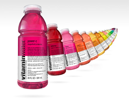
When I was in the States, I was pretty much obsessed with Vitamin Water. The Power-C got me through many long nights in Lauinger library as well as waking me up in the mornings running to class. Did it make me actually FEEL any better like the quirky on-pack text and ads claim it does? Probably not. It just quenched my thirst and tasted great. But the smart part is that by drinking it a part of you thinks, hmm, this is just as good as eating a huge bowl of broccoli (or similar green superfood). And all this is done by using one font, about 7 colours, and an ingenious bottle shape. Owned by the mighty Coca-Cola, the guys over at V-Water seem to be harking on the heritage of bottle shape being inextricably linked to the brand prowess of the product (think of that Coca-Cola bottle in every campaign, ever), and quite frankly, it works. From spinning V-Water bottles on the escalator screens in the tube to high-resolution digital panels at Piccadilly Circus shining down on tourist-central with the brand's fantastical colours, the V is all over London right now. No longer confined to the cafes in Soho for media types, it's becoming a trusted health kick for Londoners and I'm sure, soon across the country too. Clean, colourful and quirky brand tools borrowed from the likes of Innocent are creating something magical around that pink, yellow and purple water. No really, it's just water.
Their website is pretty sweet too, check it here.
0 comments:
Post a Comment